Buberry: An Iconic Rebrand

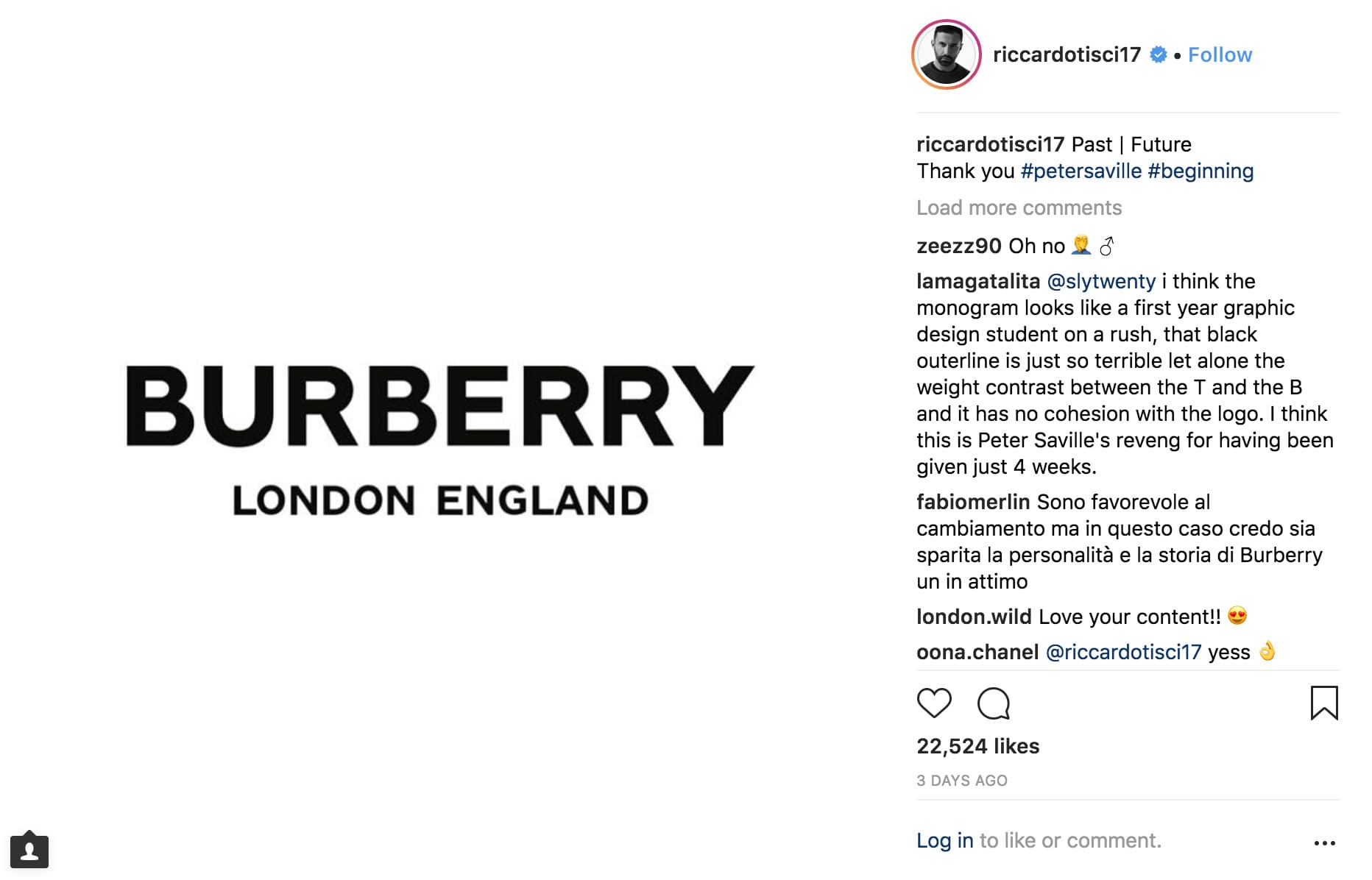
Earlier this month, Burberry unveiled a monumental transformation in its visual identity, marking the most significant shift in over a century. The iconic 160-year-old logo, adorned with the brand's name beneath an emblematic knight on horseback, has been supplanted by an unexpectedly sleek word mark. Crafted by the collaborative genius of Peter Saville and Burberry's Creative Director, Riccardo Tisci, the new design ushers in a refreshing era of minimalism for the renowned luxury brand.
The inspiration behind the redesign stemmed from a deep dive into Burberry's rich history, with Riccardo Tisci drawing from a 1908 logo and a Thomas Burberry monogram discovered in the archives. The resulting logo features a clean and modern sans-serif font (replacing the previous Bodoni font), while the monogram elegantly presents interlocking T's and B's against a honeyed background. This symbolic design pays homage to "Thomas Burberry," the visionary founder of the brand, creating a harmonious blend of heritage and contemporary aesthetics.
Navigating Burberry's rebranding poses several intricate challenges. Successfully maneuvering through a brand with deep-rooted historical foundations requires finesse, as the essence of its legacy must be preserved while ushering in a contemporary vision. Balancing this delicate act involves the preservation of the brand's heritage while simultaneously propelling it forward into a new era.

Another pivotal challenge lies in maintaining a distinctive identity amid a competitive landscape. In a market saturated with various fashion houses, Burberry must carve out a unique space, ensuring that its revamped image sets it apart from its counterparts. This demands a keen understanding of current trends, consumer preferences, and an acute awareness of the brand's inherent strengths.
Additionally, crafting a communication strategy aligned with Burberry's evolving direction is crucial. Effectively conveying the narrative of change, innovation, and modernity requires a seamless integration of messaging across various channels. The challenge lies in ensuring that the communication strategy resonates with the target audience, fostering a connection between the brand and its consumers while reinforcing the values and aspirations of the new Burberry identity.
A LEGENDARY LEGACY UNVEILED
Undertaking the rebranding of a luxury fashion house is a momentous business decision, particularly when the brand in question is Burberry—a venerable institution synonymous with values like tradition, British elegance, and an illustrious history. Notably recognized for its iconic check design, a Scottish tartan masterpiece with a beige base adorned by black, red, and white accents, Burberry's visual identity has been hallowed ground, untouched until now.
Peter Saville, in an interview with Dezeen.com, delves into the rationale behind this transformative journey. "Historically, Burberry’s logotype was fitting for the trench coat’s utilitarian nature," he reveals. "Burberry required an identity that seamlessly navigates various categories demanded of a major luxury clothing and accessories brand—something that transcends the company's provenance without disavowing it." This strategic move signals a robust departure from tradition to modernity, marking the fashion house's first rebranding since 1999 and serving as Riccardo Tisci's inaugural creative imprint since assuming the role of chief creative officer in March 2018.
Historically, Burberry’s logotype was appropriate to the trench coat’s utilitarian nature. […] Burberry needed an identity that is fluid and able to cross over into all the categories that are required of a big luxury clothing and accessories brand – something to transcend the company provenance without denying it.
FORGING DISTINCTIVENESS
In the realm of branding, maintaining a unique identity is paramount for continued relevance and visibility. While the previous branding achieved this, the current iteration appears to share commonalities with contemporaneous competitors and prevailing industry trends. The resurgence of 80s-90s vintage styles and the ubiquity of monograms, logos, and prints seem to influence Burberry's new monogram. It's plausible that influences from the intersection of high and low fashion or competitors like Gucci have played a role in shaping Burberry's current creative direction. Moreover, the minimalism of the new logo mirrors recent rebranding, such as that of Calvin Klein under the same designer selected by Burberry.
COMMUNICATING THE EVOLUTION

Riccardo Tisci has employed Instagram as a platform to disseminate information about the rebranding, sharing insights into the creative process through posts and stories. This communication strategy underscores three crucial points: the established significance of social media for luxury brands, a novel form of communication that champions transparency in the luxury sector, and a deliberate focus on engaging millennials and emerging generations of customers.
Sources:
(1) Burberry rebrands under Riccardo Tisci
(2) Burberry gave a famed designer 4 weeks to redesign its logo and heres’ what we got
(3) Peter Saville collaborates with Riccardo Tischi to design new logo for Burberry’s new graphic identity
(4) New logo for Burberry by Peter Saville
(5) The Riccardo Tisci era at the British brand is starting to take shape
(6) The History of Burberry’s Check
Image credits:
(1) Official Burberry Monogram
(2) Burberry logo shared on social media by Riccardo Tischi
(3) Burberry Instagram post
